Fashion Matching Colors is the cornerstone of impeccable style, and at mens-fashion.net, we’re here to guide you through the art of creating harmonious and stylish outfits. Mastering color combinations in clothing and accessories elevates your look, ensuring a balanced and classy appearance. Discover how to use the color wheel, understand color temperatures, and create perfect color combinations for a confident and stylish you, boosting your overall style sense and wardrobe choices.
1. What is the Fashion Color Wheel and Why Does it Matter?
The fashion color wheel is a visual tool showing the relationships between different colors, crucial for creating balanced and aesthetically pleasing outfits. Understanding this tool allows you to intentionally select colors that complement each other, enhancing your style and ensuring a harmonious look.
The color wheel, often overlooked, is a game-changer in the fashion world. Our brains perceive beauty through symmetry, balance, and recurring patterns. We instinctively respond positively to balanced color schemes in attire and accessories. Understanding the fashion color wheel provides a new perspective on color coordination, ensuring you have the resources to create a polished and stylish outfit.
According to research from the Fashion Institute of Technology (FIT), mastering the color wheel significantly enhances one’s ability to create visually appealing and harmonious outfits.
2. What Are the Primary Colors and How Are They Used in Fashion?
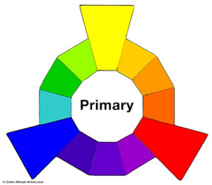
Primary colors—red, yellow, and blue—are the foundation of all other colors and are essential for creating versatile and striking outfits. Use them as bold statement pieces or mix them to create a wide range of secondary and tertiary colors.
The three primary colors are evenly spaced on the color wheel and can be mixed to create any other color. All colors are derived from a combination of these three, and they cannot be created by mixing other colors. You can incorporate primary colors into your wardrobe through standalone pieces like a red jacket or a blue shirt, or use them as accent colors in accessories.
3. What Are Secondary Colors and How Can They Enhance My Wardrobe?
Secondary colors—orange, purple, and green—are created by combining primary colors and offer a vibrant and versatile palette for enhancing your wardrobe. These colors can add depth and interest to your outfits, allowing for creative and stylish combinations.
Secondary colors are combinations of primary colors, essentially “children” of the primary colors. Orange (red and yellow), purple (red and blue), and green (blue and yellow) are secondary colors. Like primary colors, they are evenly spaced around the color wheel but centered between the primary colors. Incorporate secondary colors by pairing them with neutrals or using them as accent colors for a balanced look.
4. What Are Tertiary Colors and How Do They Add Nuance to Men’s Fashion?
Tertiary colors are created by mixing primary and secondary colors, offering a more nuanced and sophisticated palette for men’s fashion. These colors, such as aqua and coral, add depth and complexity to outfits, providing endless possibilities for stylish combinations.
Tertiary colors result from combining primary and secondary colors. Mixing primary and secondary colors creates colors like aqua and coral. Examples of tertiary colors include yellow-orange, red-orange, red-purple, blue-purple, blue-green, and yellow-green. Tertiary colors can subtly enhance an outfit, adding sophistication and visual interest.
5. What is Color Temperature and How Does it Affect Fashion Choices?
Color temperature refers to the warm (red to yellow) and cool (green to violet) tones that can influence how a color is perceived, affecting your overall fashion choices. Understanding color temperature helps you select colors that complement your skin tone and create the desired mood for your outfit.
Classifying colors by temperature is another useful approach. Warm colors range from red to yellow, while cool colors range from green to violet. Neutral colors are “colorless” and include black, gray, white, brown, and shades in between. Warm colors appear more active, arousing or stimulating the viewer, while cool colors recede, promoting calm and relaxation.
- Warm colors include yellowish white through red, such as red, orange, yellow, and brown.
- Cool colors include bluish-white colors like blue, purple, and green.
- Neutral colors include black, gray, white, off-white, brown, charcoal, and beige.
Choosing colors based on their temperature can greatly impact the overall aesthetic of your outfit.
6. How Do I Match Colors to Create the Perfect Outfit Combination?
Matching colors involves understanding how colors interact on the color wheel to create visually appealing combinations, leading to the perfect outfit. Using complementary, analogous, or triadic color schemes helps you achieve a balanced and stylish look.
Understanding the color wheel and color temperatures makes it easy to match colors that are pleasing to the eye and create a beautifully matched outfit.
7. What Are Complementary Colors and How Do They Create Striking Outfits?
Complementary colors are pairs on opposite sides of the color wheel that create striking outfits due to their high contrast and visual balance. Using combinations like red/green, yellow/purple, and blue/orange can make your outfits pop while maintaining harmony.
Complementary colors are colors on opposite sides of the clothing color wheel, such as red/green, yellow/purple, and blue/orange. These colors always match well. Usually, the colors are the same distance from the center of the color wheel, but you can experiment with varying distances to produce a satisfying combination. A professional designer’s trick is to select two complementary colors and use a slightly darker shade for one. For example, instead of red/green, opt for red and olive green for variety while retaining a harmonious color combination.
8. What Are Analogous Colors and How Do They Create Harmonious Looks?
Analogous colors are shades that are next to each other on the color wheel, creating harmonious looks through subtle and pleasing color combinations. Using shades like red, reddish-orange, and orange together results in a cohesive and stylish outfit.
Analogous colors, also known as dominance harmony, are continuous shades on the clothing color wheel. Different shades of the same color almost always look great together, providing another way to produce matching color combinations. Red, reddish-orange, orange, and yellow-orange are examples of analogous colors.
9. What Are Triadic Colors and How Can I Use Them for Vibrant Ensembles?
Triadic colors are equally spaced on the color wheel, forming a triangle and creating vibrant ensembles. Using combinations of red, yellow, and blue, or other equally spaced colors, results in eye-catching and balanced outfits.
Triadic colors are equally spaced on the wheel, forming a triangle. These include not just the primary and secondary colors but any combination of colors that are equally spaced. Triadic colors look good together and are typically quite vibrant.
10. What Are Split Complement Colors and How Do They Offer a Pleasing Balance?
Split complement colors start with one color and then use the two colors adjacent to its complement on the color wheel, offering a pleasing balance. This approach allows for a harmonious yet interesting color scheme, such as pairing red with yellow-green and blue-green.
Split complement colors are also pleasing to the eye. To find them, start with a color, then find the two colors next to its complementary color (the color on the opposite side of the wheel). Surprisingly, these colors often provide a pleasing balance. For example, the complementary color for red is green. The two adjacent colors, yellow-green and blue-green, also work well in an outfit that is predominantly red.
11. What Are Tetradic Colors and How Do They Create Rich Color Schemes?
Tetradic colors, also known as double complementary, use a rectangle of colors on the color wheel to create rich color schemes. This method requires one color to dominate the others to harmonize properly, making it ideal for professionally designed patterns.
Tetradic colors, also called double complementary, are the richest of all color schemes but the most difficult to harmonize properly. A tetradic color scheme requires one color to dominate. These colors can be uncovered by looking for a rectangle of colors on the clothing color wheel. Similarly, a square color scheme uses four colors spaced evenly around the color circle. Pleasant tetradic color schemes are difficult to form but are sometimes found in professionally designed patterns.
12. What Role Does Skin Tone Play in Choosing Fashion Colors?
Matching colors to your skin tone is crucial for enhancing your appearance; cooler colors suit pale or yellow-toned skin, while warmer colors complement deeper skin tones. Choosing colors that harmonize with your skin tone ensures a flattering and cohesive look.
Matching colors with your skin tone is essential. Cooler colors like navy, blue, and shades of green pair well with pale or yellow-toned skin, while warmer colors like gold and amber look good with deeper skin tones.
13. How Important is it to Keep Color Families Together in an Outfit?
Keeping color families together, such as matching pastel colors with pastels or jewel tones with jewel tones, ensures a cohesive and balanced outfit. This approach creates a harmonious visual effect, enhancing your overall style.
Keeping color families together is important. For instance, match pastel colors with other pastels, jewel tones with jewel tones, etc.
14. Does Material Type Affect How Colors Should Be Matched?
Matching colors of the same material type, like pairing dark leather shoes with a dark leather belt, is crucial for a polished look. Naturally occurring colors in certain materials should be matched to maintain consistency and style.
Naturally occurring colors in certain materials should be matched. For instance, if you wear dark leather shoes, choose a dark leather belt.
15. What Are Some Common Color Matching Mistakes Men Make and How Can I Avoid Them?
Common color matching mistakes include overusing bright colors, not considering skin tone, and ignoring the color wheel. To avoid these, balance bright colors with neutrals, choose colors that complement your skin tone, and use the color wheel as a guide.
16. How Can I Use Neutral Colors to Enhance My Outfit?
Neutral colors like black, white, gray, and beige serve as a versatile base for any outfit, allowing brighter colors to pop and providing balance. These colors can be used for staple pieces, making it easier to mix and match with bolder hues.
17. What Are the Best Color Combinations for a Professional Look?
For a professional look, opt for classic combinations like navy and gray, black and white, or shades of blue. These combinations convey sophistication and professionalism, making them ideal for office environments.
18. How Can I Incorporate Bold Colors Into My Wardrobe Without Looking Over the Top?
Incorporate bold colors by using them as accent pieces, such as a vibrant tie or pocket square, paired with neutral clothing. This approach adds a pop of color without overwhelming your outfit, keeping your look stylish and balanced.
19. What Are Some Timeless Color Combinations That Always Work?
Timeless color combinations include navy and white, black and gray, and shades of beige. These combinations are classic and versatile, suitable for various occasions and always in style.
20. How Can I Use Accessories to Add Color to My Outfit?
Accessories are a great way to add color to your outfit. Use colorful ties, scarves, pocket squares, or socks to introduce pops of color without committing to bold clothing pieces. This allows for flexibility and easy changes to your look.
21. What Colors Should Men With Fair Skin Tone Avoid?
Men with fair skin tones should avoid colors that wash them out, such as pale yellows or very light greens. Instead, opt for deeper, richer colors that provide contrast and enhance their complexion.
22. What Colors Complement Men With Dark Skin Tone the Most?
Men with dark skin tones can pull off a wide range of colors, but they particularly shine in vibrant hues like royal blue, emerald green, and deep reds. These colors complement their complexion and create a striking appearance.
23. How Can I Use Color to Create a Slimming Effect?
Use darker colors like black, navy, and charcoal to create a slimming effect. These colors absorb light, making you appear leaner. Pair them with lighter colors in strategic areas to balance your silhouette.
24. What Are the Dos and Don’ts of Mixing Patterns and Colors?
When mixing patterns and colors, do ensure that they share a common color or are complementary. Don’t mix too many patterns or colors at once, as this can create a chaotic look. Balance is key to a stylish and cohesive outfit.
25. How Can I Stay Updated on the Latest Color Trends in Men’s Fashion?
Stay updated on the latest color trends by following fashion blogs, magazines, and social media accounts. Mens-fashion.net offers regular updates on seasonal color trends, helping you keep your wardrobe current and stylish.
Keeping up with the latest trends can be challenging, but mens-fashion.net makes it easy.
26. What Are the Best Resources for Learning More About Color Theory in Fashion?
Great resources for learning about color theory in fashion include books on color theory, online courses, and fashion blogs like mens-fashion.net. These resources provide in-depth knowledge and practical tips for mastering color combinations.
27. How Can I Build a Versatile Wardrobe Using Color Theory?
Build a versatile wardrobe by investing in neutral basics that can be paired with various accent colors. Use the color wheel to choose complementary and analogous colors for your accent pieces, creating numerous stylish combinations.
28. What Are the Best Colors to Wear for a First Date?
For a first date, choose colors that make you feel confident and comfortable. Navy, burgundy, and olive green are excellent choices that convey sophistication and style without being too flashy.
29. How Can I Use Color to Express My Personality Through Fashion?
Use color to express your personality by choosing colors that reflect your mood and style preferences. If you’re bold and outgoing, opt for vibrant hues; if you prefer a more understated look, stick to muted tones and classic combinations.
30. What Are the Best Colors to Wear During the Different Seasons?
- Spring: Pastels and light neutrals
- Summer: Bright, bold colors and white
- Autumn: Warm, earthy tones
- Winter: Rich, deep colors and jewel tones
31. What is the Influence of Color Psychology on Fashion Choices?
Color psychology suggests that colors evoke specific emotions and perceptions, influencing how others perceive you. Understanding these effects helps you strategically choose colors that align with your desired image and intentions. For instance, blue often conveys trustworthiness and professionalism, while red can signal confidence and energy.
32. What is the Role of Undertones in Fashion Color Matching?
Undertones refer to the subtle hues beneath the surface of your skin, which can be warm, cool, or neutral. Identifying your undertone is essential for selecting clothing colors that harmonize with your complexion, enhancing your natural coloring and creating a balanced appearance.
33. How Does Cultural Context Impact the Perception of Fashion Colors?
Cultural context significantly impacts the perception of fashion colors, as different cultures may associate specific colors with varying meanings and symbolism. Understanding these cultural nuances is crucial when traveling or engaging with diverse communities to avoid misinterpretations and show respect for local customs.
34. What is the Significance of Color Blocking in Modern Men’s Fashion?
Color blocking involves pairing contrasting colors to create bold and visually striking outfits, often seen in modern men’s fashion. This technique allows you to make a statement and showcase your fashion-forward sensibility, but it requires careful planning to ensure a balanced and cohesive look.
35. How Can I Choose the Right Colors for Accessorizing a Monochromatic Outfit?
When accessorizing a monochromatic outfit, opt for contrasting colors that stand out against the primary hue, adding visual interest and depth to your look. Consider using metallic accents like gold or silver, or introduce pops of color through accessories like scarves, ties, or pocket squares.
36. What Are the Essential Colors for Building a Capsule Wardrobe?
Building a capsule wardrobe requires selecting essential colors that can be easily mixed and matched, creating numerous outfit combinations. Key colors to include are:
- Neutral tones: Black, navy, gray, white, and beige
- Versatile accents: Burgundy, olive green, and denim blue
37. How Can I Coordinate Colors for Layered Outfits?
Coordinating colors for layered outfits involves selecting a cohesive color palette and arranging layers in a way that enhances the overall look. Start with a neutral base and add layers in complementary or analogous colors, ensuring each piece contributes to a balanced and stylish ensemble.
38. What Are the Best Practices for Matching Colors in Casual vs. Formal Wear?
Matching colors in casual wear allows for more experimentation and bolder combinations, while formal wear typically requires a more conservative approach with classic and understated colors. Tailor your color choices to suit the occasion and maintain an appropriate level of sophistication.
39. How Can I Use Color to Highlight My Best Features?
Use color to highlight your best features by wearing colors that complement your eye color, hair color, and skin tone. For example, if you have blue eyes, wearing a blue shirt can enhance their vibrancy, while wearing colors that match your undertones can make your skin glow.
40. How Does Age Influence My Choice of Fashion Colors?
Age can influence your choice of fashion colors, as certain colors may be more appropriate for different stages of life. While younger men can experiment with bolder and trendier colors, older men may prefer classic and sophisticated hues that reflect their maturity and style.
Navigating the world of fashion colors can be overwhelming, but with the right guidance, you can unlock your style potential. At mens-fashion.net, we provide the insights and resources you need to master color combinations and elevate your look.
Ready to transform your wardrobe? Explore mens-fashion.net for the latest trends, expert advice, and inspiration. Visit us at mens-fashion.net or contact us at Address: 227 W 27th St, New York, NY 10001, United States and Phone: +1 (212) 217-5800.
FAQ: Mastering Fashion Matching Colors for Men
1. Why is fashion matching colors important for men’s style?
Fashion matching colors is important because it helps create a harmonious and aesthetically pleasing look. A well-coordinated outfit shows attention to detail and can significantly enhance your overall appearance.
2. What is the color wheel and how does it help in fashion?
The color wheel is a visual tool that shows the relationships between colors. It helps in fashion by providing a guide to create balanced and complementary color combinations, such as using complementary, analogous, or triadic color schemes.
3. What are the primary colors, and how can I use them in my outfits?
The primary colors are red, yellow, and blue. You can use them in your outfits by incorporating them as standalone pieces or by mixing them to create secondary and tertiary colors. Primary colors can make bold statement pieces or serve as accent colors.
4. What are secondary colors, and how can they improve my wardrobe?
Secondary colors are orange, purple, and green, created by combining primary colors. They can improve your wardrobe by adding depth and interest to your outfits, allowing for creative and stylish combinations when paired with neutrals or used as accent colors.
5. How does color temperature affect my fashion choices?
Color temperature refers to warm (red to yellow) and cool (green to violet) tones. Understanding color temperature helps you select colors that complement your skin tone and create the desired mood for your outfit. Warm colors are stimulating, while cool colors are calming.
6. What are complementary colors, and how do they create striking outfits?
Complementary colors are pairs on opposite sides of the color wheel, such as red/green, yellow/purple, and blue/orange. They create striking outfits due to their high contrast and visual balance.
7. What are analogous colors, and how do they create harmonious looks?
Analogous colors are shades that are next to each other on the color wheel. Using shades like red, reddish-orange, and orange together results in a cohesive and stylish outfit, creating harmonious looks.
8. How can I use neutral colors to enhance my outfit?
Neutral colors like black, white, gray, and beige serve as a versatile base for any outfit, allowing brighter colors to pop and providing balance. Use them for staple pieces to easily mix and match with bolder hues.
9. What are the best color combinations for a professional look?
For a professional look, opt for classic combinations like navy and gray, black and white, or shades of blue. These convey sophistication and professionalism, ideal for office environments.
10. How can I incorporate bold colors into my wardrobe without looking over the top?
Incorporate bold colors by using them as accent pieces, such as a vibrant tie or pocket square, paired with neutral clothing. This adds a pop of color without overwhelming your outfit, keeping your look stylish and balanced.